Blackletter construction, spacing and page color
Frank Chouteau Brown treats blackletter as both a set of forms and a pattern of dark and light across the page. His Gothic chapter pairs a construction example credited to Albrecht Dürer with manuscript alphabets, then considers spacing and the overall visual color of a line or panel. This adds a practical layer to the broader distinctions in Gothic and Old English letters.
Read the construction, then the finished forms
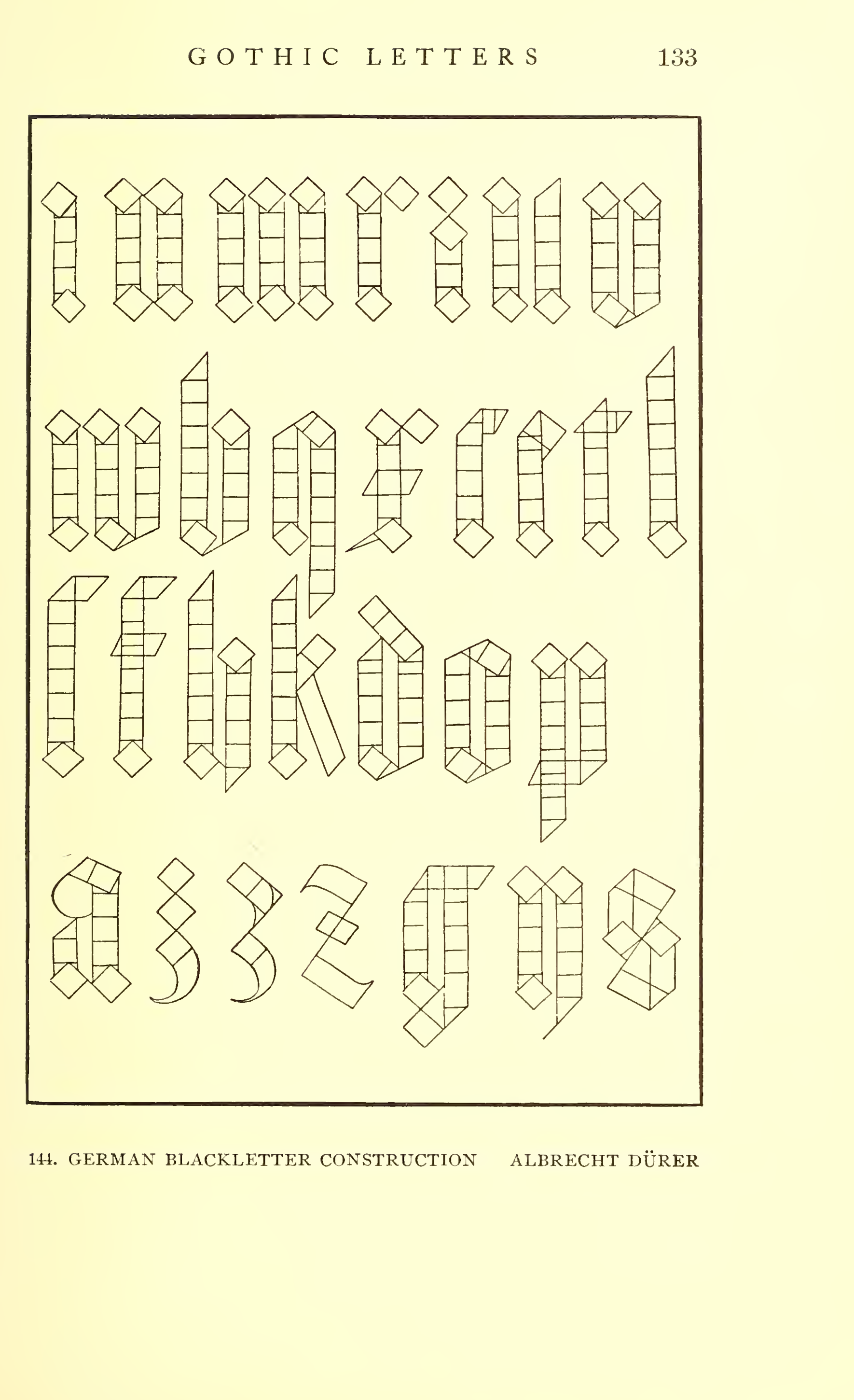
Section titled “Read the construction, then the finished forms”Brown’s Figure 144 is captioned “German Blackletter Construction.” The drawing breaks capital forms into repeated vertical units, measured divisions and angled or diamond-shaped components. Brown calls it an example of blackletter construction; the plate makes the framework visible before the letters are read as a finished alphabet. His list of illustrations attributes it to Albrecht Dürer and identifies its source as Underweyssung der messung (Nuremberg, 1525).
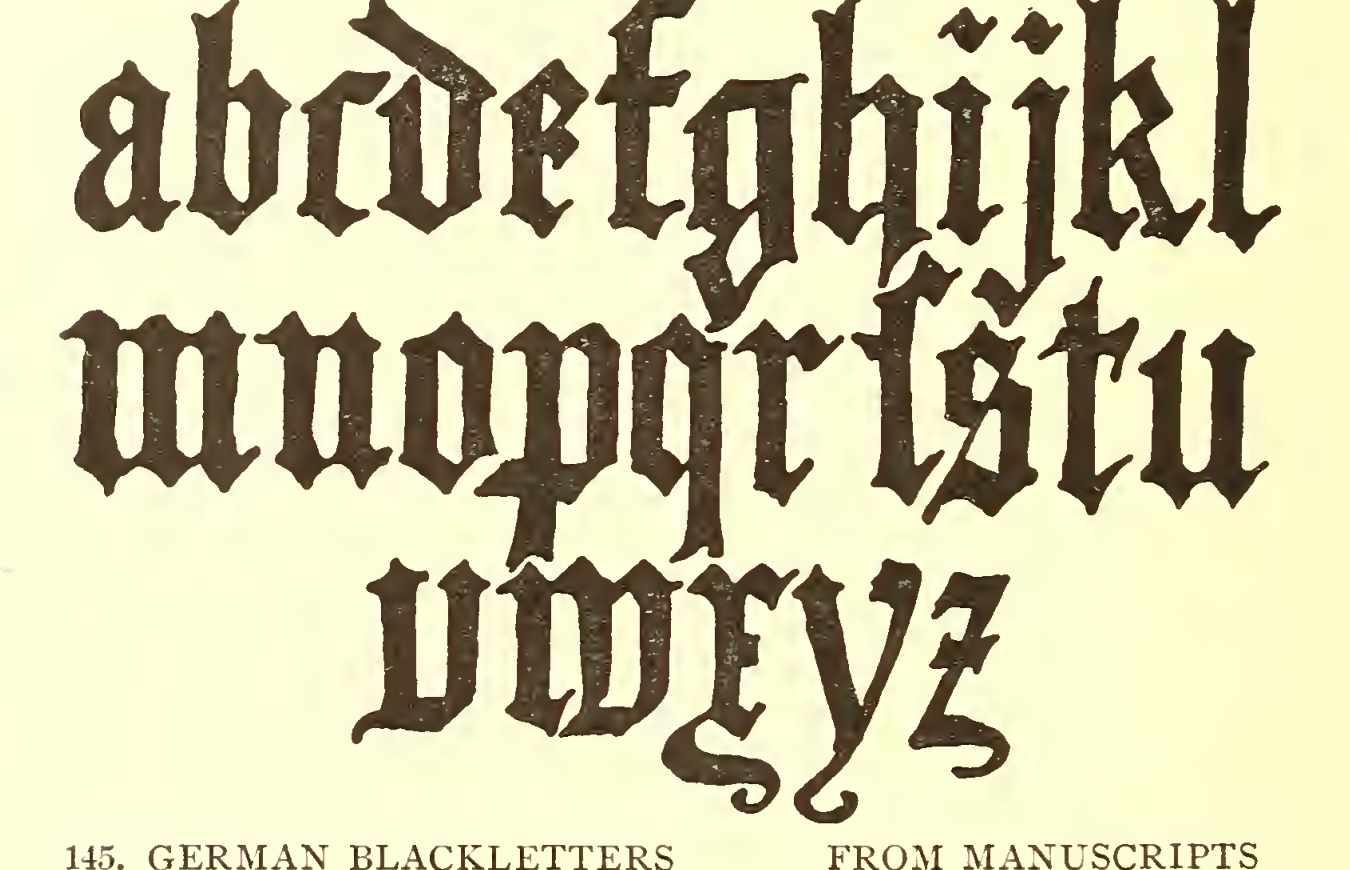
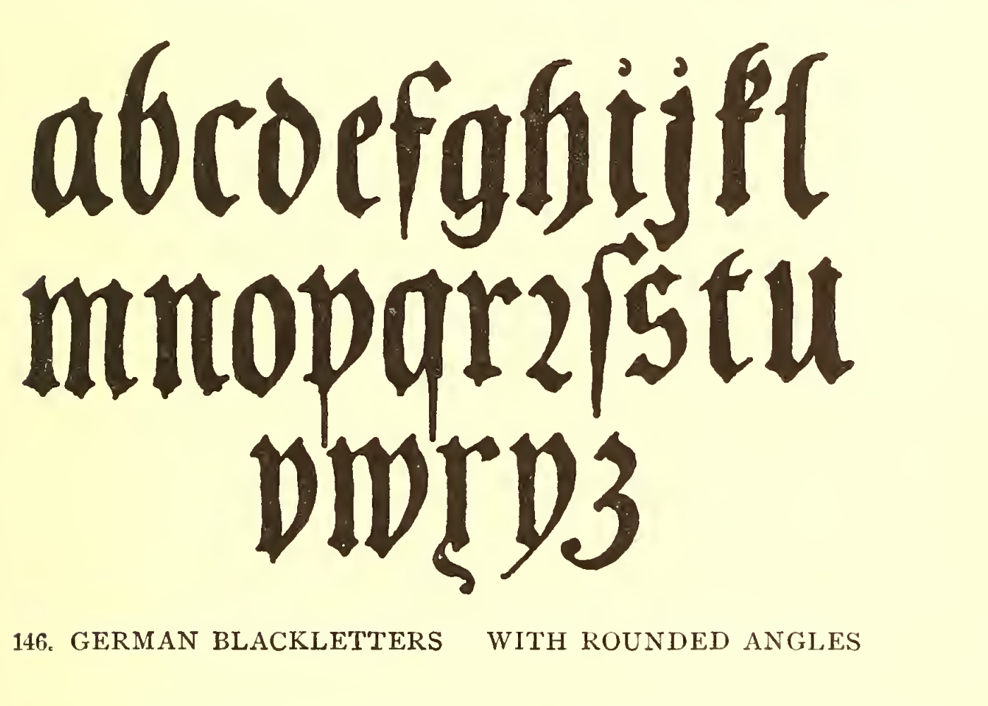
Figures 145 and 146 shift from construction to manuscript-derived lowercase alphabets. Brown labels the first as German blackletters from manuscripts and the second as forms with rounded angles. Compare the repeated verticals and the shapes of the counters, then notice how rounded corners change the texture without changing the basic blackletter character. Neither caption names a particular manuscript or individual draughtsman.
Judge the dark and light together
Section titled “Judge the dark and light together”On printed pp. 134-135, Brown says a blackletter line or page should have an even overall color. He recommends keeping the white gaps between letters fairly consistent, about the width of the spaces within the vertical strokes of the lowercase forms. But he also warns that too much black makes individual letters harder to read. The point is to balance a cohesive dark pattern with legible letter shapes, not to make every gap mechanically identical.
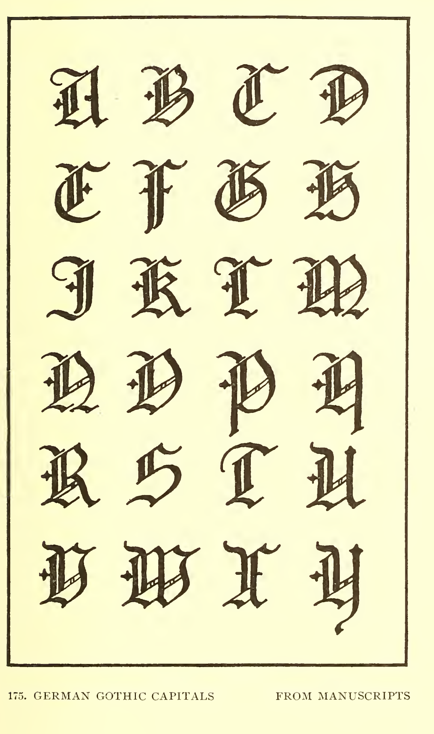
Brown’s Figure 175 separates the capitals from the manuscript lowercase examples. It is captioned “German Gothic Capitals from Manuscripts”; the book does not name the source manuscripts or a particular calligrapher. Use it to compare the distinct weight and ornament of capitals with the line texture in Figures 145-146, rather than assuming that capitals should simply enlarge the lowercase forms.
Practice a blackletter name panel
Section titled “Practice a blackletter name panel”Use Brown’s examples for a drawing comparison, not as a ready-made memorial pattern:
- Choose a short name or word and sketch its lowercase blackletter forms from one of the manuscript examples.
- Make two versions: one with angular forms and one with rounded angles. Keep the letter heights and word widths comparable so the change in form is easy to see.
- Adjust the white gaps until the line has a steady overall rhythm, then check that the counters and individual letters remain distinct.
- Add a Gothic capital from Figure 175 and compare its weight with the lowercase line. Try the whole name and an initial-only version inside the same panel outline.
- Judge the sketches at the panel’s intended proportions and ordinary viewing distance. The exercise adapts Brown’s page-design discussion for a modern memorial drawing; it is not a cutting or spacing specification.
For optical adjustment between individual letters, compare the separate guidance in letter spacing. For a broader survey of alphabet coverage and source plates, see monumental alphabets. For a Roman-family comparison, see Roman letters; to carry a chosen alphabet into a planned text field, continue with Day on inscription composition.
Source and editorial credit
Section titled “Source and editorial credit”Frank Chouteau Brown, Letters & Lettering: A Treatise with 200 Examples, Boston: Bates & Guild Company. The physical title leaf is dated MCMIX (1909); the copyright leaf reads “Seventh Thousand” and gives copyright 1902. Internet Archive’s Smithsonian-contributed catalog record lists 1902. This article cites the scanned 1909 printing, not an assumed 1902 first printing. Figures 144-146 are printed pp. 133-135 (Archive PDF pp. 157-159); Figure 175 is printed p. 165 (PDF p. 189). The title leaf names Brown as author. Figure 144 is credited to Albrecht Dürer; no individual maker is identified for Figures 145, 146 or 175. See the Brown source record.
The source record for this Smithsonian item is marked “No Copyright - United States.” This is U.S.-only item-level evidence, not a worldwide rights determination. The crops are lossless selections from 400 ppi renders, and the smaller JPEGs are separate display derivatives. The full PDF remains in private review storage.