Illuminated initials and borders
In a manuscript, an enlarged initial can signal where a book, chapter, or paragraph begins. Johnston calls these display capitals versals. They may sit inside a line, take up part of the text block, or stand in the margin. From the initial, a pen-drawn stem can grow into foliage and a border. The figures below show that process as a sequence of decisions: build the letter, place it, establish the main stem, then fill and balance the surrounding space.
These are historical manuscript examples, not cutting patterns or specifications for memorial work. For the related forms used in stone lettering, see Roman letters and inscription design.
Construct the letter before decorating it
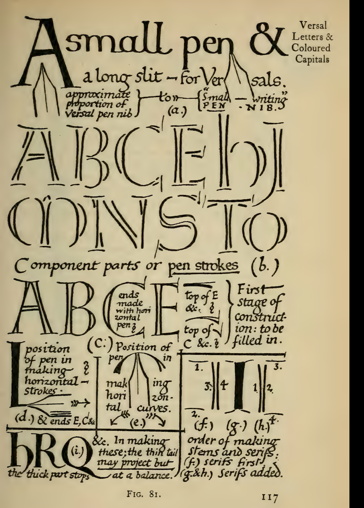
Section titled “Construct the letter before decorating it”Johnston’s Fig. 81 separates a versal into pen strokes and shows one possible order for making stems and serifs. Its notes mark a first construction stage before the forms are filled in. This helps a beginner see a decorated capital as a built form with parts that must fit together, rather than as a single outline. It is a pen-lettering diagram: its stroke order is not a stone-cutting sequence. Broad-edged pen explains how nib position affects the written stroke.
Choose where the initial belongs
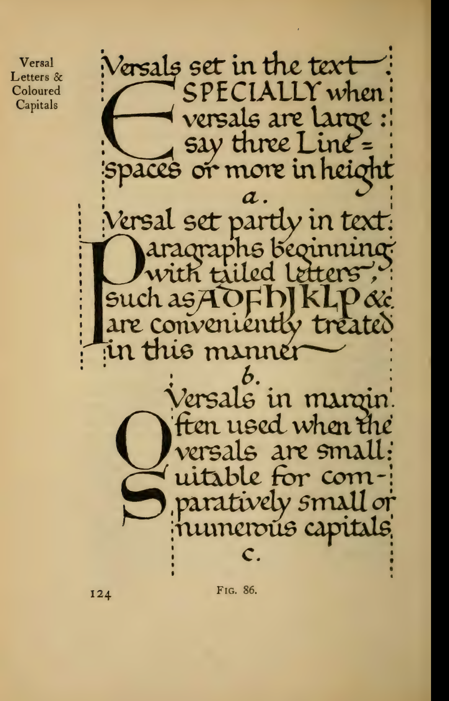
Section titled “Choose where the initial belongs”The same letter can organize a page in different ways. Fig. 86 compares a large capital set into the text, a capital sharing the text area, and smaller versals arranged in the margin. The dotted guides make the relationship to line height and column width visible. The useful lesson is to decide how the initial meets the text before adding ornament around it.
Grow a border from its starting stem
Section titled “Grow a border from its starting stem”Johnston describes the initial as a natural “root” for a border. Fig. 122 shows the first stage: a main stem and branches sweep through the available field, with numbered strokes to show their sequence. Notice how the large curves occupy most of the ground before smaller details are added. In a different design, the stem might spring from the side or an extremity of the initial.
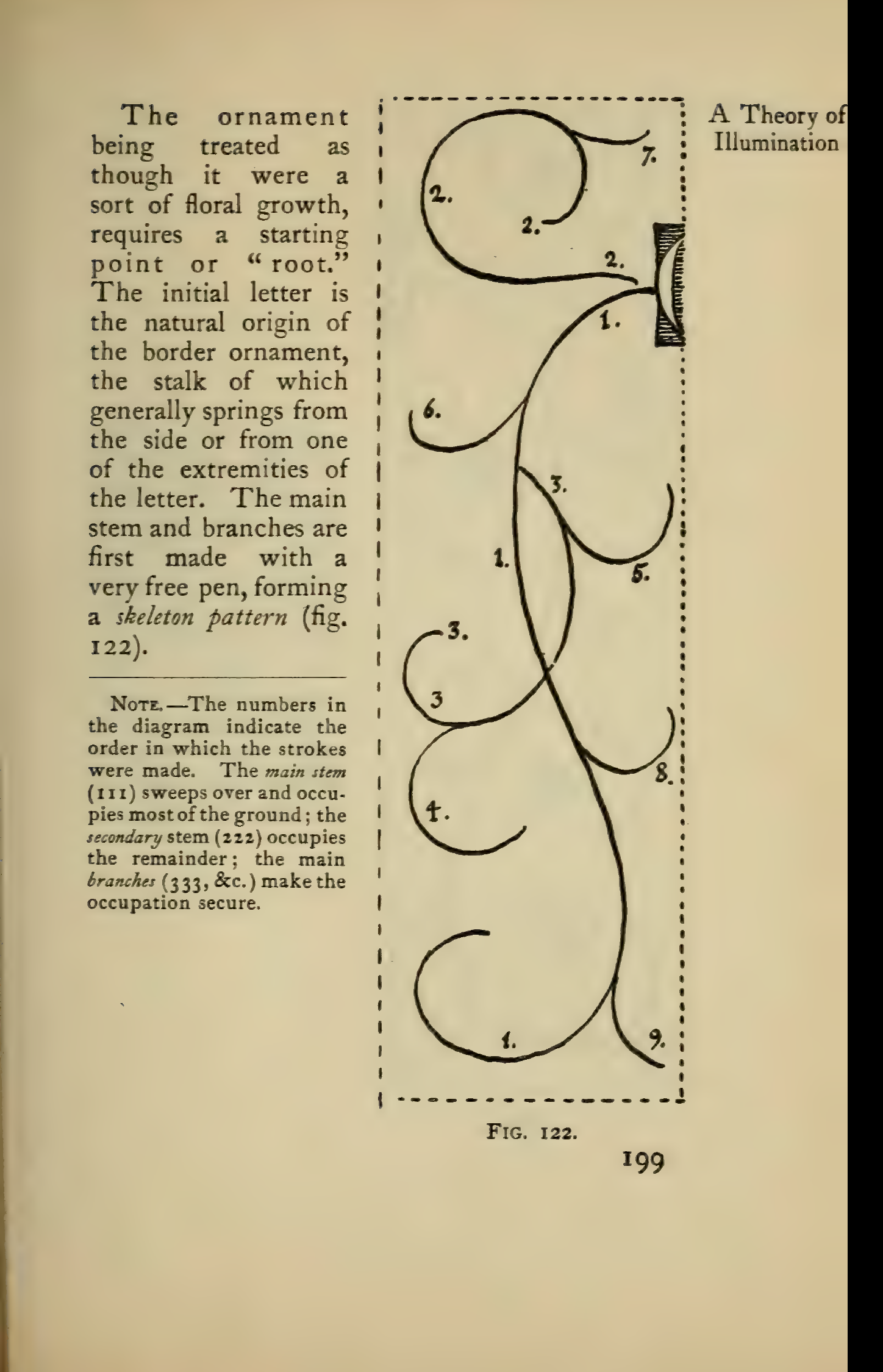
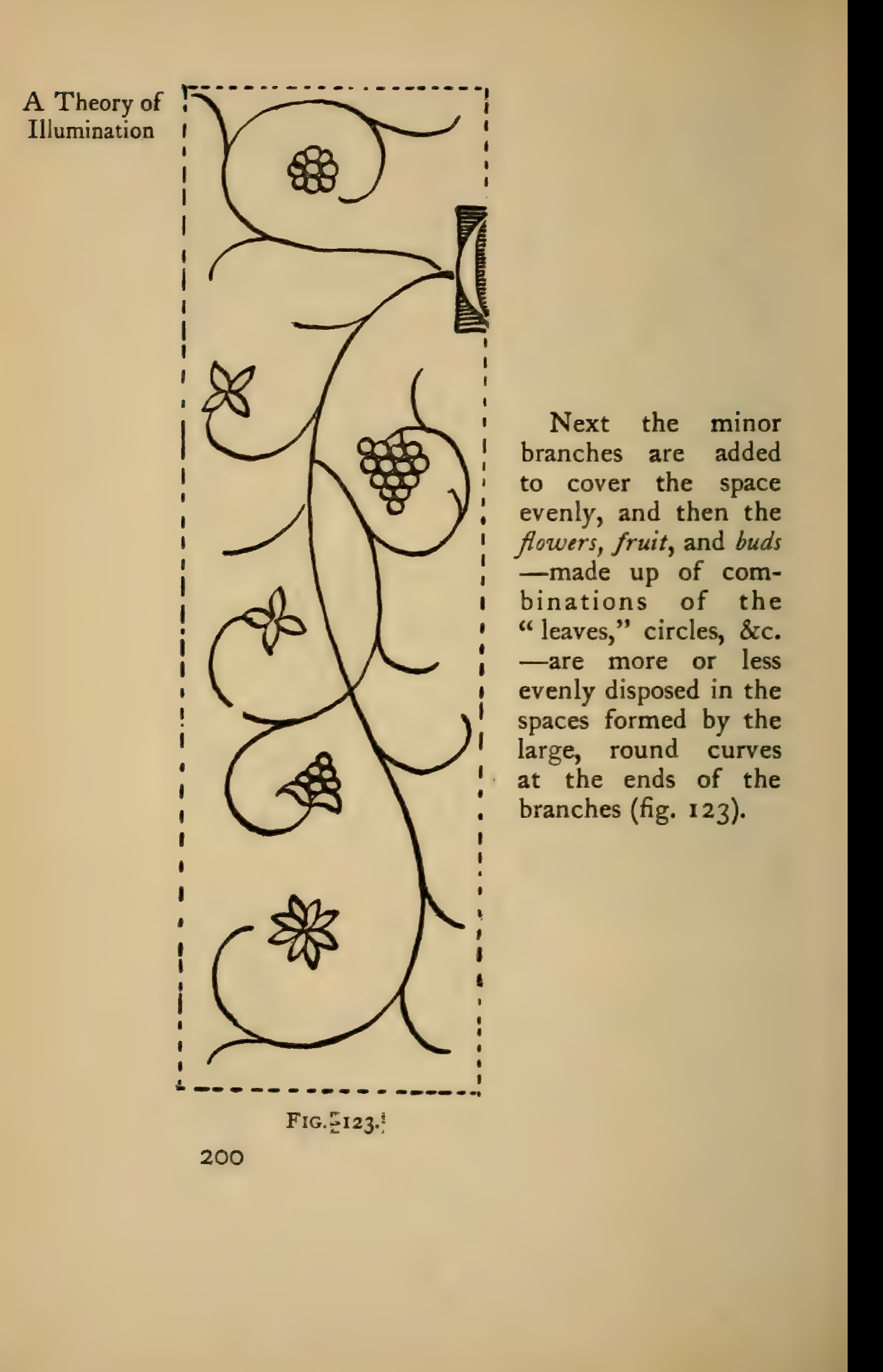
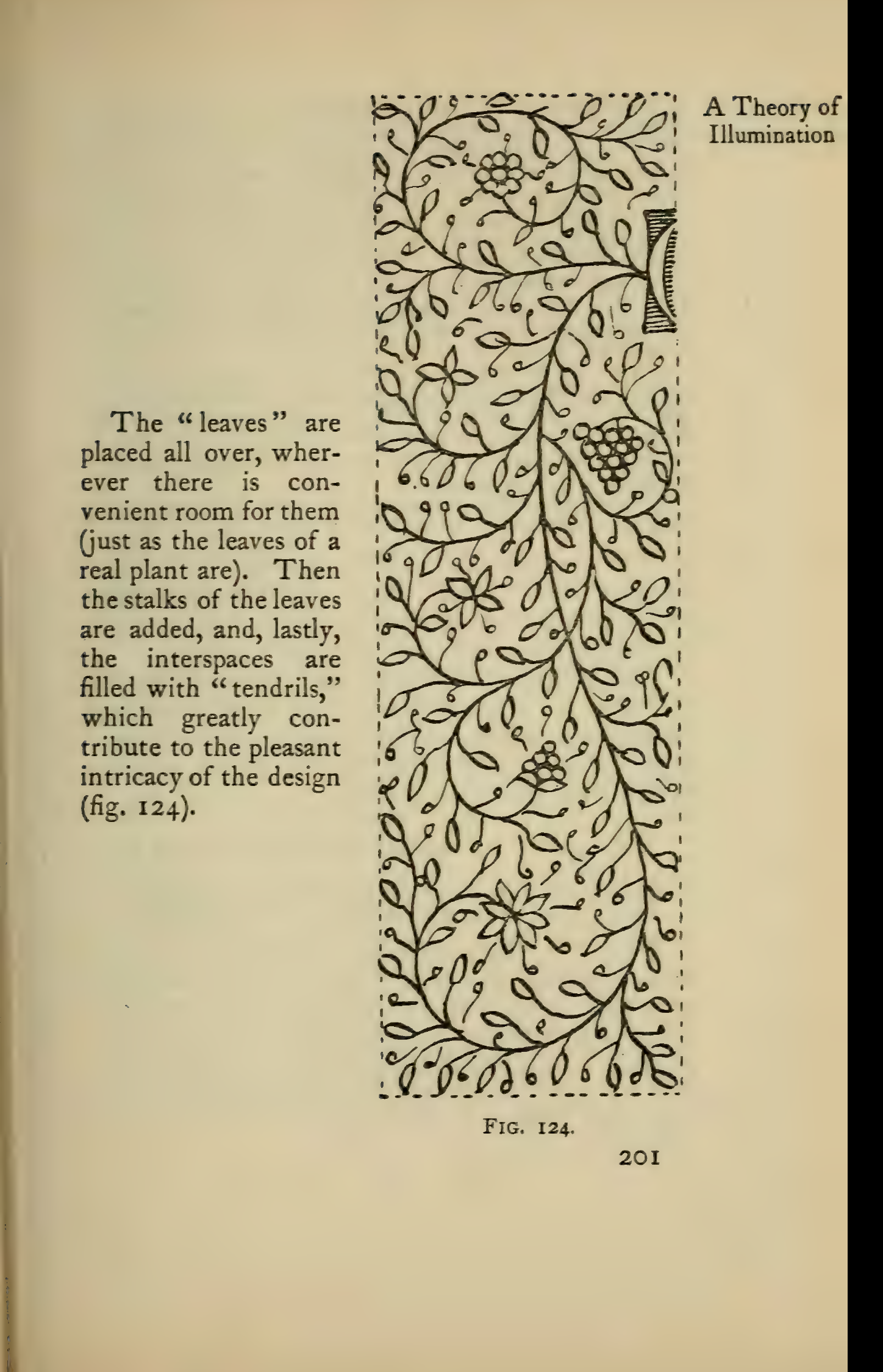
Fig. 123 develops that framework by adding smaller branches and simple flower, fruit, and bud shapes in the openings. Johnston says to distribute these forms through the spaces made by the broad curves. In Fig. 124, leaves and their stalks are added, then tendrils fill the remaining gaps. This progression makes the border easier to read: establish the large movement first, then use smaller repeated marks to balance the open areas.
For related trade ornament on stone, compare inscription design and traced ornament. Those pages address memorial decoration; the figures here explain manuscript penwork and its compositional structure.
Contain an initial and repeat a border pattern
Section titled “Contain an initial and repeat a border pattern”Fig. 127 shows two different relationships between a capital and its decoration. In the elaborated E, woven ornament divides the background into smaller fields, while the whole design remains contained by the letter’s outline. Johnston also notes a knot as a possible starting point for a filigree border when there is no initial. He identifies the E as a reproduction from a tenth- or eleventh-century manuscript (British Museum, Egerton 608); the image here is Johnston’s printed figure, not a new scan of that manuscript.
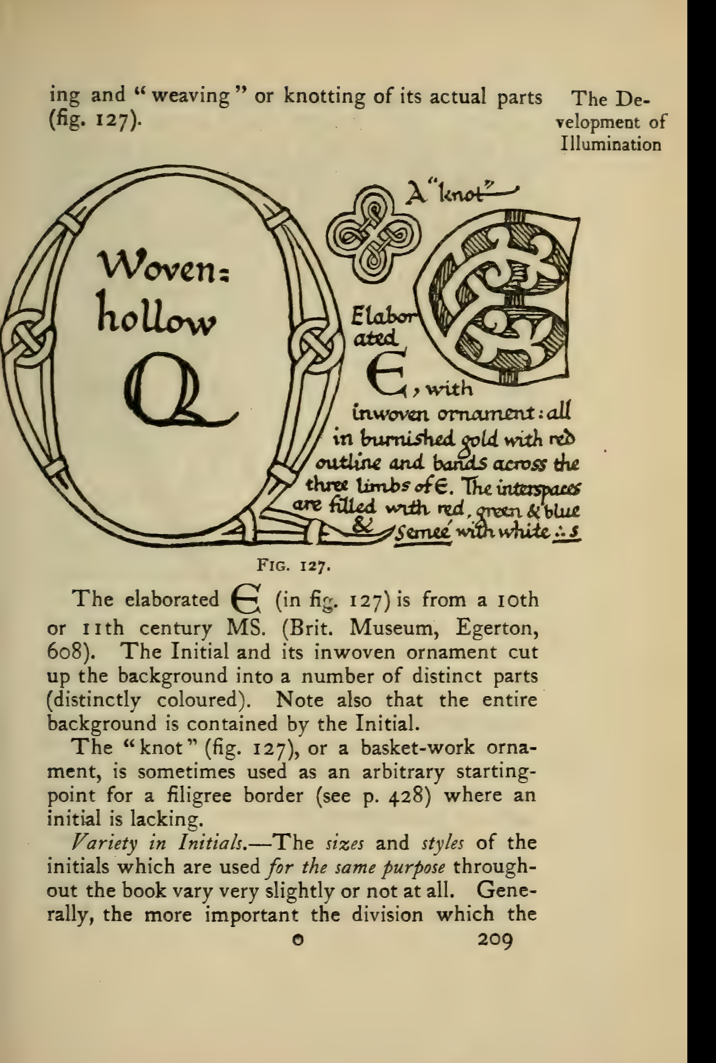
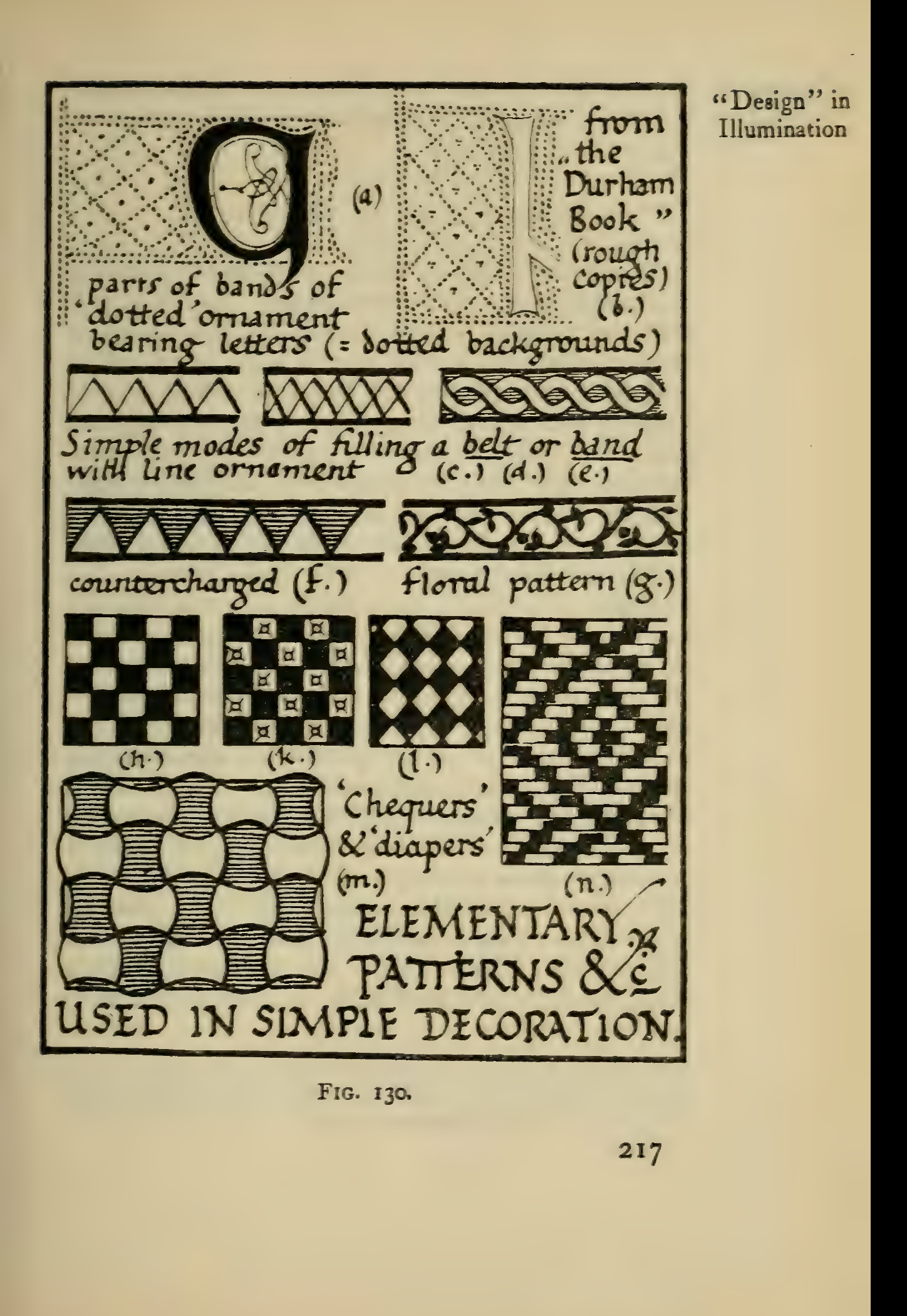
Fig. 130 shifts from a single initial to patterns that can fill a band. It compares simple lines, repeated zigzags, woven and floral forms, checks, and diaper patterns. The plate is useful for seeing how a limited motif can repeat across a strip; it is a reference sheet, not a ready-made memorial border.
Historical colour and gold
Section titled “Historical colour and gold”Johnston’s later chapters discuss coloured initials, pigments, mordants, and gold leaf as historical manuscript practices. This article uses those chapters only for context and does not reproduce their chemical, pigment, or metal-preparation recipes. Period pigment names and mixtures are not current safety guidance; some materials and processes may be hazardous or obsolete. For any present-day material, follow its current safety data and qualified guidance rather than a period formula.
Source and illustration credit
Section titled “Source and illustration credit”All seven figures come from Edward Johnston, Writing & Illuminating, & Lettering (London: John Hogg, 1906), Chapters VII, XI, XII, and XIII. PDF and printed page numbers are given in each caption. The title page credits diagrams and illustrations collectively to Johnston and Noel Rooke; no individual maker is identified for these figures. Figure 127 reproduces a manuscript example Johnston attributes to the British Museum, Egerton 608; the other diagrams are Johnston’s explanatory figures. The exact Archive scan used for these crops remains in private review storage and is not included in the wiki. The Smithsonian Libraries record labels the item “No Copyright - United States”; that is a U.S.-only rights statement, not a worldwide status claim. See Sources & acknowledgments.