Plan the inscription before its frame
In Chapter IV, “Monumental Inscriptions,” Lewis Foreman Day starts with the words and their line divisions, then turns to the frame. His example is a practical way to estimate a text block before drawing its panel; it is not a rule for changing approved copy or a modern production specification.
Put the copy into lines first
Section titled “Put the copy into lines first”Day’s sequence begins with a first estimate of how many lines the inscription needs and how long those lines should be. He then writes the words continuously, counts the letters, and treats the gap between words as roughly one letter when estimating how much will fit. From that estimate he marks likely line endings on a rough copy and adjusts the distribution until the block suits the design (printed pp. 46-47; Archive PDF pp. 82-83).
The count is a planning aid. It estimates the length of the inscription block; it does not determine the visible space between every pair of letters. Once the copy and line breaks are settled, Day says to design the tablet or frame for that lettering rather than distort the lettering to fit a poorly chosen frame (printed p. 44; Archive PDF p. 80).
Compare the text field with its frame
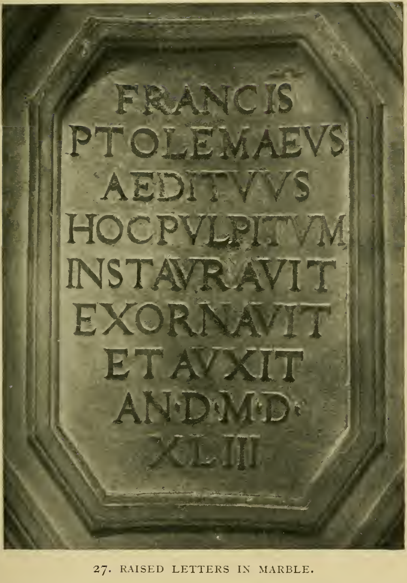
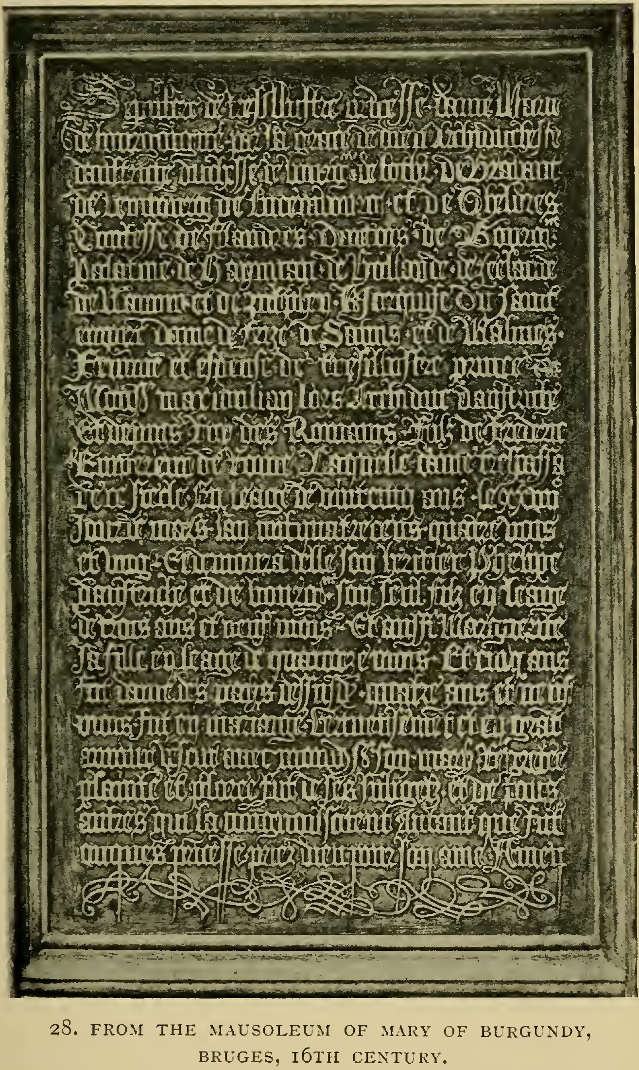
Section titled “Compare the text field with its frame”Day’s Figures 27 and 28 show two very different inscriptions before Figure 29 introduces a laurel-framed field. Figure 27 is a short raised-letter text in marble, centered within an angular panel. Figure 28 is a long Gothic inscription on the tomb of Mary of Burgundy: the compact rows fill a tall field, with scrollwork gathered at its beginning and foot. The letterforms and ornament differ, but the text remains organized as a readable block.
In the discussion between these examples, Day argues that lines need not all be equal in length, yet they should usually make a compact, rectangular mass. A wreath may force the lettering to follow its enclosing lines; otherwise, he warns against letting a florid border pull the text into arbitrary, wandering edges. Read these examples as a historical design argument, not as a rule that every memorial needs a rectangular panel.
Read the inscription inside its ornament
Section titled “Read the inscription inside its ornament”Figure 29 gives the method a visible setting. A laurel wreath and carved figures surround a central field of separate horizontal lines. Notice how the branches define the available space while the lettering remains an orderly block inside it. The example links decorative framing to inscription composition without turning the wreath into a line-by-line template.
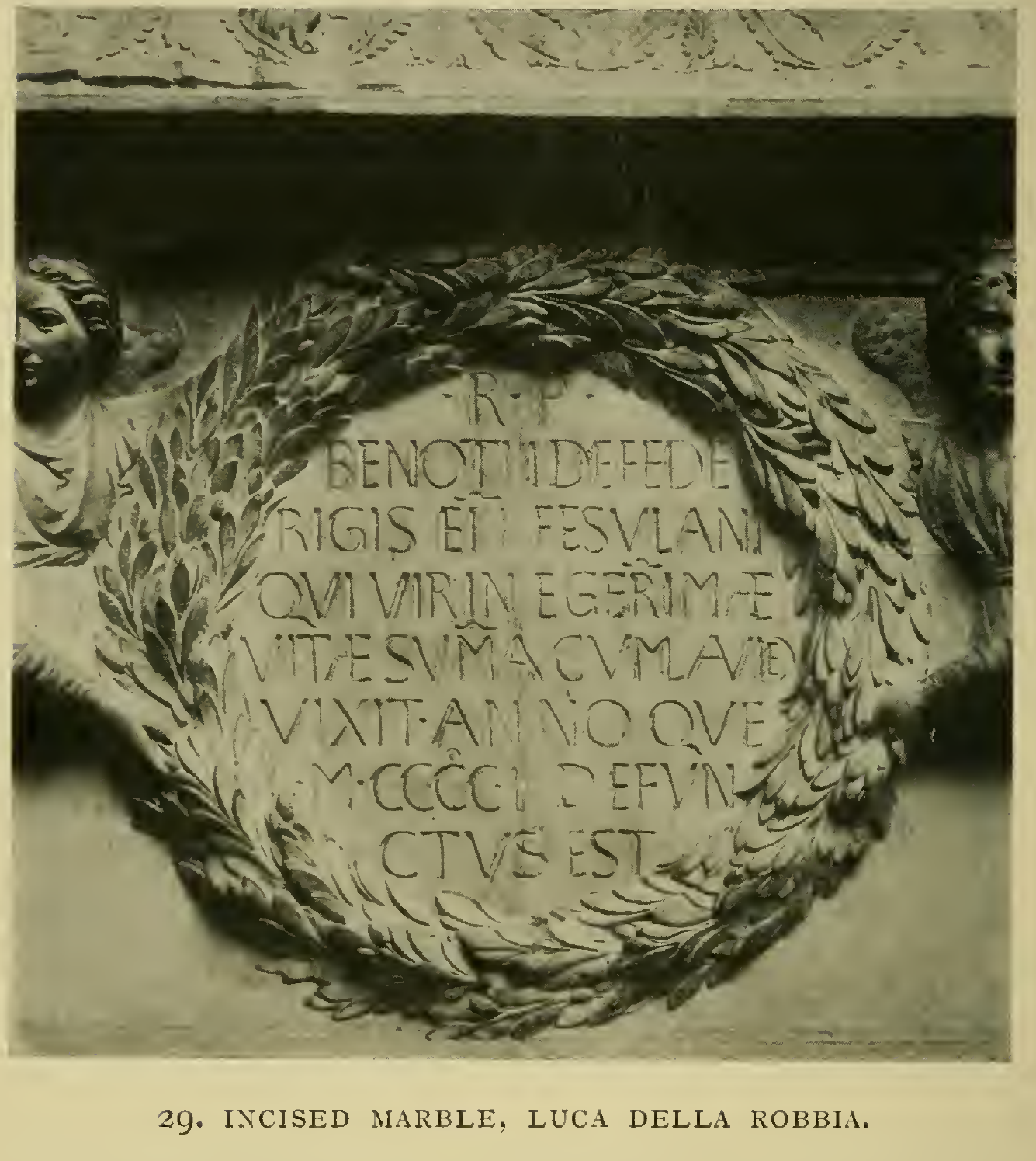
Figures 27-29 show three ways to keep the wording legible as its support changes: a recessed marble panel, a dense Gothic tomb field, and a Roman inscription within laurel. Day’s Figs. 30-31 are material examples rather than further steps in this layout comparison; see Metal lettering in Day’s examples for the embossed silver-gilt inscription and cast-iron grave-slab image.
Compare the planning stages
Section titled “Compare the planning stages”Inscription design already covers Cook’s panel variations and line spacing. Day adds a specific preliminary step: estimate the copy as lines before designing the boundary that will contain it. For a later view of the completed text block, see inscription layout, which reproduces A. E. R. Gill’s examples in Edward Johnston’s 1906 volume. Gill distinguishes massed lines of similar lengths from centered arrangements and shows how hierarchy reads within a panel; those observations complement Day’s earlier copy-fitting estimate. The chapter and figures are credited to Gill where the book names him, not to Johnston by default.
Day’s inter-word-space count is only an estimate for line length. For the optical adjustment of the gaps between individual letters, see letter spacing. Keep the customer’s approved text intact: discuss any proposed copy or line-break change with the customer before treating it as final. Day’s Fig. 28 is a finished Gothic inscription, not a construction diagram; compare Brown’s blackletter lesson. To follow text into decorated initials and foliage, see Johnston’s illumination and borders and Page’s foliage studies. Day’s scroll-label lesson studies a shaped text field whose folds change the reading path. Brown’s panel-enlargement diagrams then show how to change the enclosing rectangle without changing its proportions.
Source and editorial credit
Section titled “Source and editorial credit”Lewis Foreman Day, Lettering in Ornament: An Enquiry into the Decorative Use of Lettering, Past, Present, and Possible, London: B. T. Batsford; New York: Charles Scribner’s Sons. The title leaf is undated; the Smithsonian Libraries and Internet Archive records identify this edition as 1902. This article uses Chapter IV, printed pp. 43-47 (Archive PDF pp. 79-83), and reproduces figures 27, 28 and 29: printed p. 43 / PDF p. 79; printed p. 45 / PDF p. 81; and printed p. 46 / PDF p. 82. Day’s captions identify Fig. 27 as raised letters in marble and Fig. 28 as the Mausoleum of Mary of Burgundy in Bruges; neither caption names a maker of the book’s printed reproduction. Day attributes the underlying Federighi tomb in Fig. 29 to Luca della Robbia; its printed-image maker is not named. See the Day source record.
The original scan was cropped without changing the historical image. A separate display copy is downsampled; selecting the figure opens the full-resolution crop. The source PDF remains in private review storage and is not bundled with the wiki.