Broad-edged pen: how the edge makes the stroke
A broad-edged pen makes a strong starting point for understanding letters because its marks come from a simple relationship: the width and direction of the nib’s flat edge, and the direction the pen moves. The edge does not flex to make a thick stroke. Held at one angle, it lays down a broad mark when the pen travels across the edge and a narrow mark when it travels along it.
Edward Johnston’s 1906 handbook explains this in the “Acquiring a Formal Hand” chapters. Chapter II, “Tools,” starts on printed p. 48; Chapter III, “Methods,” starts on p. 61. The examples below are from Chapter II, printed pp. 52–53 and Chapter III, printed p. 66. The reprinted figures are historical demonstrations; their particular angles and recipes are not universal modern specifications.
First, look at the nib
Section titled “First, look at the nib”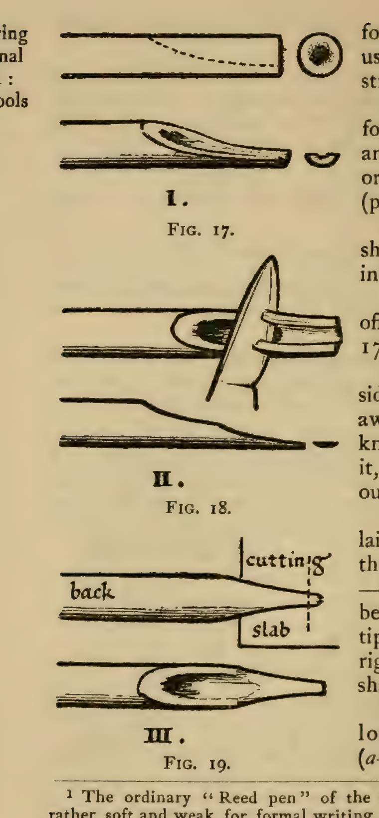
The drawing is a reed pen example, not instructions for cutting a modern steel nib. Its teaching point is the flat chisel edge: two corners and a straight edge span the width of the mark. The slit carries ink to the edge, but the slit itself is not what creates the thick-and-thin pattern.
Cut angle and stroke direction work together
Section titled “Cut angle and stroke direction work together”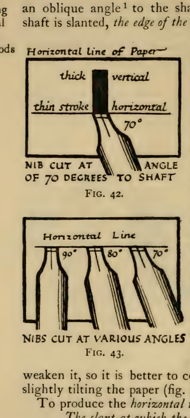
The cut angle sets the nib edge’s direction relative to the shaft. The holding angle turns that edge relative to the page. Johnston’s diagram shows a 70° example where the nib is cut at about 70° to the shaft so the edge lies parallel to the paper’s horizontal line. In that position, a downstroke across the edge can use its full width; a side-to-side stroke along the edge stays thin. Turn the nib and the contrast shifts with it.
This is the source of the familiar thick-and-thin pattern in a broad pen’s letters. In a Roman-style capital, a downstroke may become a broad stem while a cross-stroke stays fine. Curves change width as their direction changes against the fixed edge. That stroke logic helps explain how hand movement can lead to letter structure; compare the examples in Roman letters and monumental alphabets.
A safe way to study the effect
Section titled “A safe way to study the effect”Start with a ready-made broad-edge calligraphy pen or a purpose-made broad nib. On scrap paper, hold the pen steadily and draw a few slow lines in different directions without pressing hard. Watch when the mark is broad, when it is thin, and how a curve changes as it turns across the edge. Then try a simple letter and compare its stems, joins, and open spaces with a model. Keep the nib’s orientation consistent while testing so you can see the effect clearly.
Johnston’s period description includes knife work on reed and quill. Treat those drawings as historical evidence, not a beginner blade tutorial. If a nib must be cut, use a stable cutting surface, a sharp tool suited to the material, and cut away from the hand and body; secure the material rather than holding it in the blade path. Beginners should use a ready-cut nib or ask an experienced instructor to prepare it.
The pen is a study tool, not a stone-cutting specification. Letter forms change when drawn large, transferred, and cut into stone. Use it to see where the contrast in a letter comes from, then consider inscription scale and spacing separately in letter spacing and inscription layout.
Source and image notes
Section titled “Source and image notes”Edward Johnston, Writing & Illuminating, & Lettering (London: John Hogg, 1906), Part I, Chapters II–III. Text and illustrations are reproduced from the Internet Archive scan of the Smithsonian Libraries item. The book credits diagrams and illustrations to Johnston and Noel Rooke, but does not name the maker of each figure. The Smithsonian item is marked “No Copyright – United States”; that supports this U.S.-only reuse determination, not a worldwide claim. The Project Gutenberg transcription is useful for searching the text, but notes that its illustrations were refurbished; these figures were cropped from the Archive’s scan instead. No full PDF is included in the wiki.