Inscription layout
Layout connects a design on paper with the marks a cutter follows on stone. J. W. Wyckoff described squares, guide lines and a prepared drawing surface; Robert L. Cook emphasized a full-size detail supplied by the designer. Their accounts document two parts of the same workflow. (LM PDF pp.14, 22, 105-106, 129-134)
Drawing instruments
Section titled “Drawing instruments”Wyckoff favored a T-square and triangle for straight lines. A separate shop hint describes Gus Lynch’s adjustable lettering square, whose blades could follow the angles of a diminishing die. These tools governed alignment; they did not settle the visual spacing between differently shaped letters. (LM PDF p.14; DM PDF p.70)
From sketch to full-size detail
Section titled “From sketch to full-size detail”Cook compared small sketches before developing the inscription at full size. He described center lines, light guides and tracing-paper copies for the shop. This gave the designer a way to resolve the arrangement before handing it to the cutter. His distinction was between designing the lettering and executing an already resolved detail, not between skilled and unskilled work. (LM PDF pp.96, 105-106, 129-134)
Inscription design covers the block of text; letter spacing covers the gaps within a line. Keeping those decisions separate makes the historical workflow easier to follow.
Diamond pencil
Section titled “Diamond pencil”Arthur Berliner of Forest Park, Illinois, reported using a diamond-tipped scriber for straight inscription lines on polished granite. The permanent scratch survived removal of the temporary coating. He claimed cleaner work and time savings; those are his shop observations, not a comparative test. The source distinguishes the scriber from the chisel used for curves. (DM PDF p.66; LM PDF p.159)
This account explains the instrument’s purpose. It does not prescribe marking or cutting a finished stone.
Reading hierarchy and margins in examples
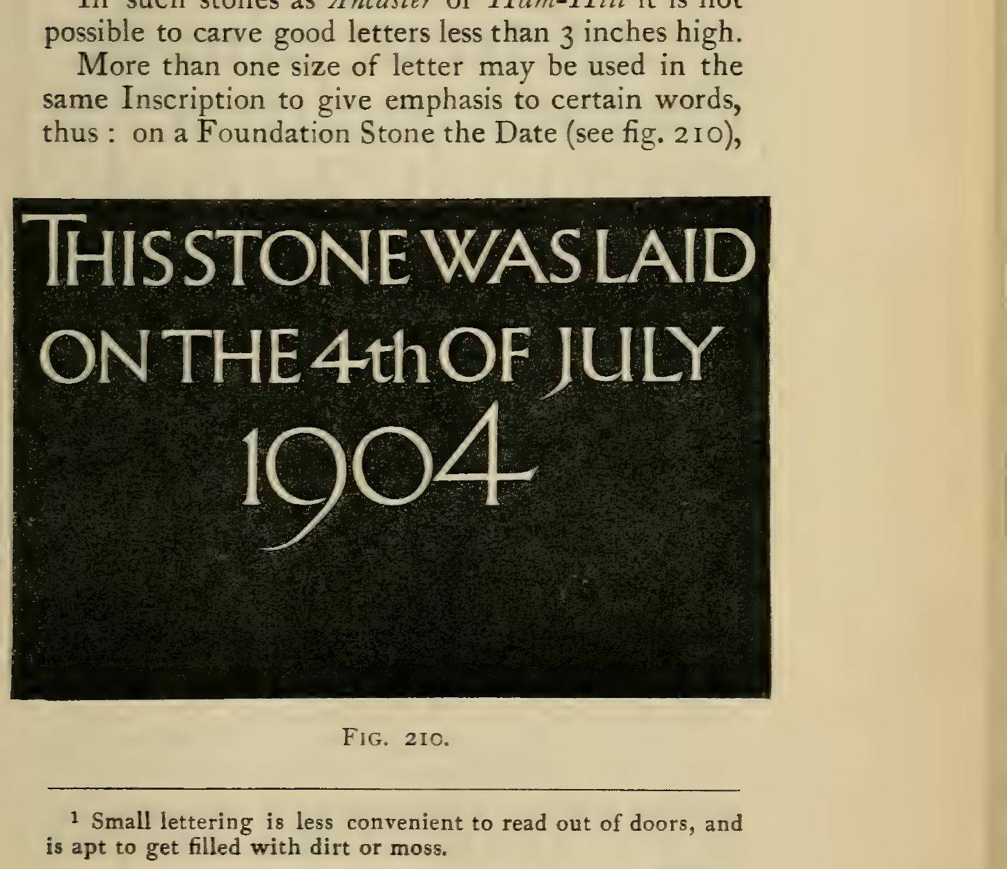
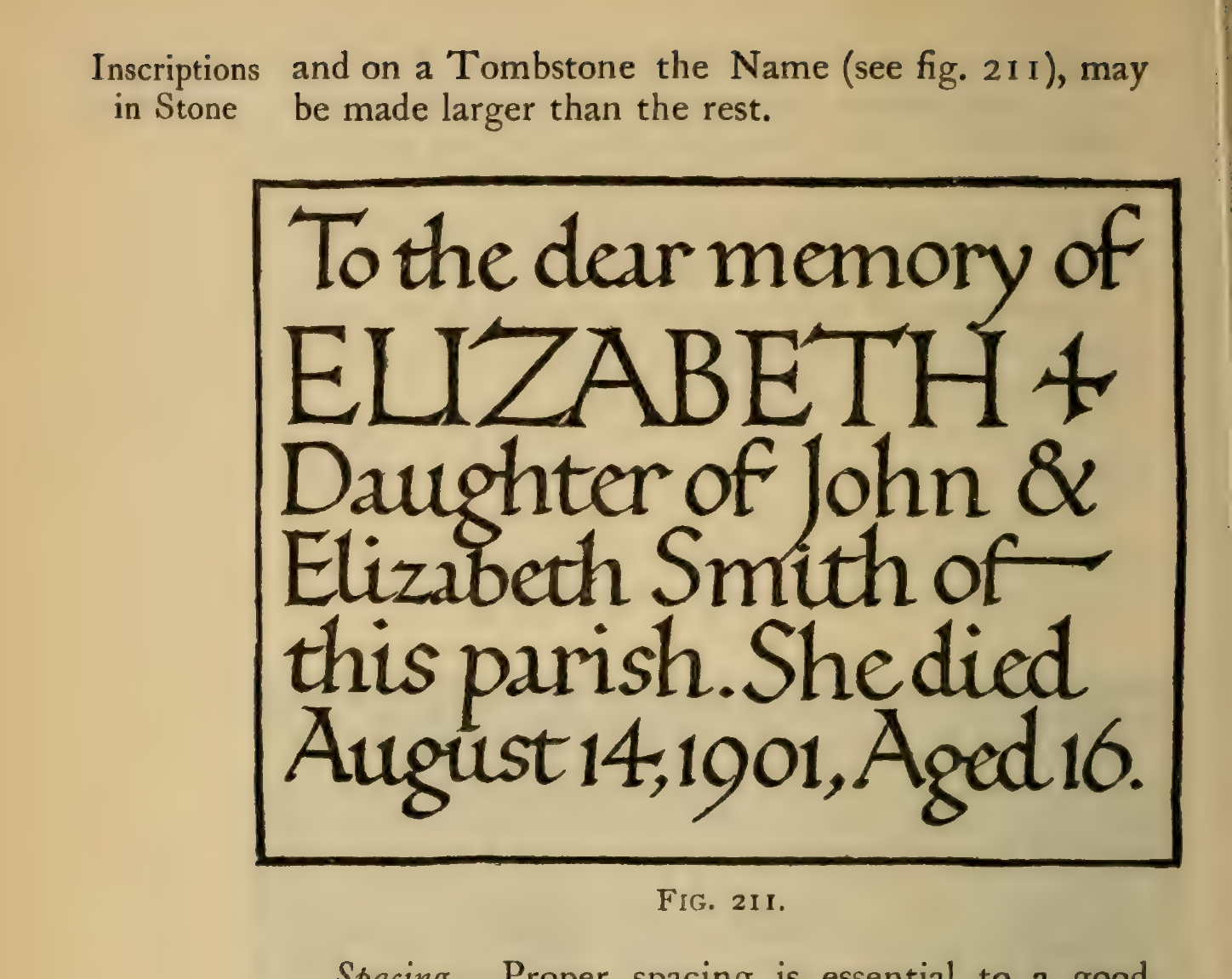
Section titled “Reading hierarchy and margins in examples”Gill shows how a change in letter size can give one part of an inscription more emphasis. In the foundation-stone example, the date is larger than the surrounding words. In the memorial panel, the name “ELIZABETH” is larger than the biographical lines. Look also at how the panel moulding frames the text: on a shaped panel, that boundary helps define the available margin. These are examples to read, not templates to copy; the appropriate hierarchy and spacing depend on the inscription and the space available. Gill also distinguishes “massed” arrangements, with lines kept at similar lengths, from centered arrangements whose line lengths vary. His period size and material prescriptions are historical, not current guidance.
Sources
Section titled “Sources”-
LM p.14, 22, 25–26, 30, 96, 105–106, 128–134 — Wyckoff (Part One) and Cook (Part Three).
-
DM p.69–70.
-
DM PDF p.66; LM PDF p.159 (Arthur Berliner shop report).
Source and editorial credit
Section titled “Source and editorial credit”LM publication record · DM publication record.
This is a modern AI-assisted editorial summary. Named contributors are credited with their specific statements above; unidentified contributors remain unverified. Publication editors are not assumed to have written individual articles. Page references use the private scan; source access, edition and rights limitations are recorded in the linked register.